Controls
Switch devices on or off, or fine-tune values in real-time—right from your dashboard.
Control Cards are interactive widgets that allow a user to send commands directly to connected devices through a selected channel. These cards provide an intuitive interface for real-time device control within the dashboard.
There are two types of Control Cards:
-
Switch Cards – for sending boolean values (ON/OFF)
-
Slider Cards – for sending numeric values (e.g., volume, power)
Switch Card
The Switch Card allows a user to send boolean values (true or false) to a connected client via a channel. This is useful for devices that support simple on/off behavior, such as relays, motors, or lights.
Create a Switch Card
To create a Switch Card:
- Ensure the dashboard is in Edit Mode.
- Click the Add Widget button and select Switch.
- The Create Switch dialog will appear.
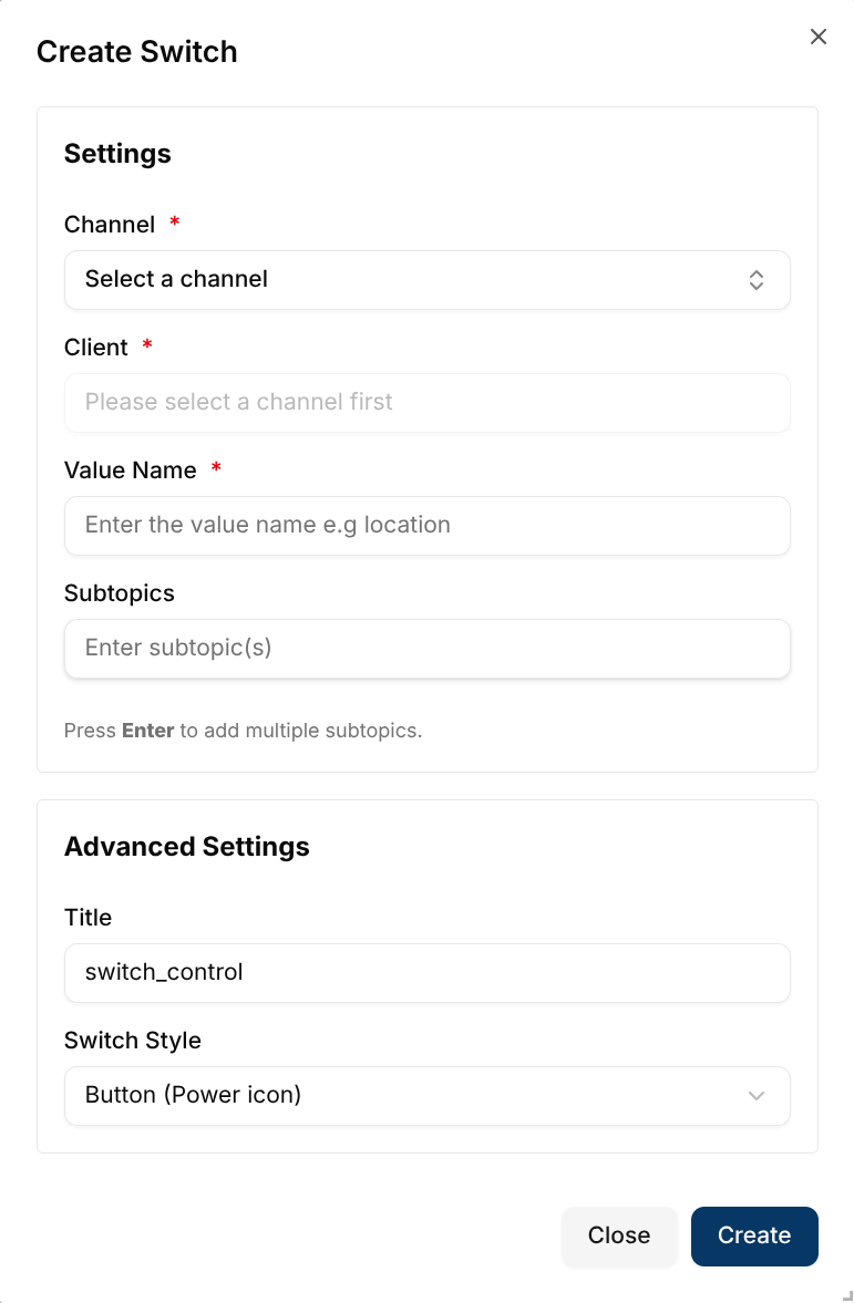
Configure the Switch Card
Configuration Fields:
- Channel (Required) - The channel to which the message is sent.
- Client (Required) - The target device receiving the command.
- Value Name (Required) - The name of the value being controlled (e.g., volume).
- Subtopic - Optional message subtopic.
Advanced Settings:
- Title - Optional label for the widget on the dashboard.
- Switch Style - Controls the visual style of the toggle:
- Button (Power icon) – Displays a circular power button. The button turns green when the device is ON.
- Slide Toggle – Displays a large horizontal slide switch that turns green when ON.
Once all fields are complete, click Create. The Switch Card will be added to the dashboard.
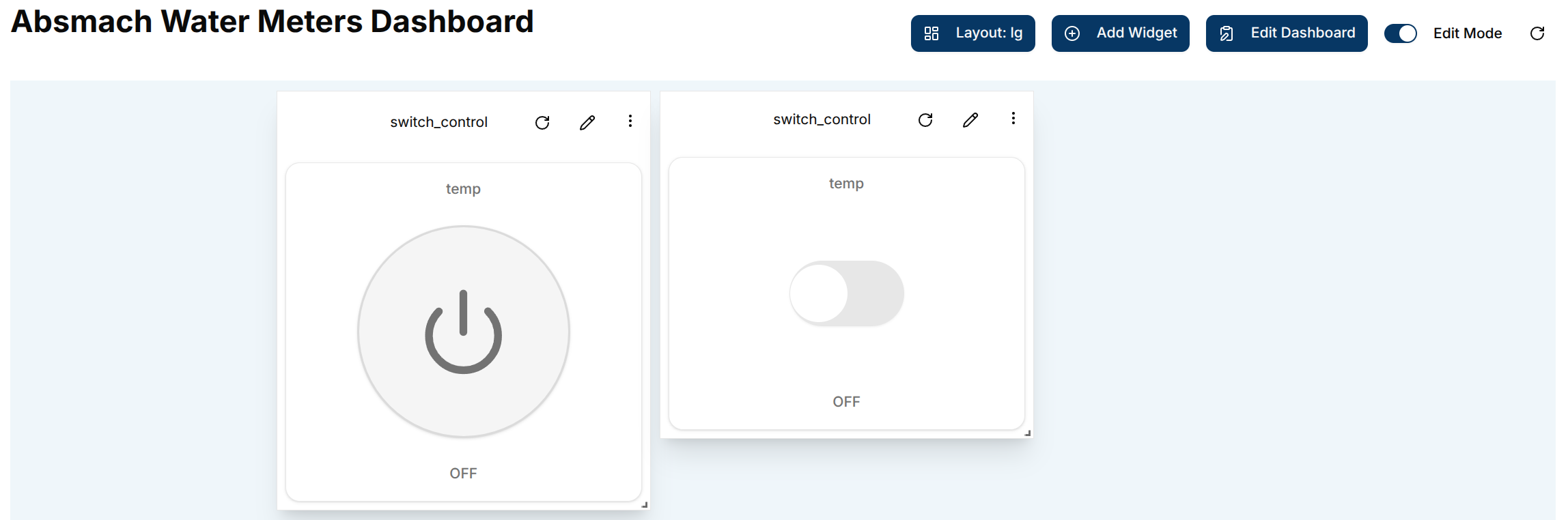
Use a Switch Card
After creation, the switch card shows:
- The configured value name at the top
- The toggle control in the center (power button or slide, depending on the chosen style)
- An ON / OFF status label at the bottom
The default state is OFF. Toggle the control to ON to send a true command to the client.
Edit the Switch Card
Click the pencil icon on the widget to open the Update Switch dialog.
Editable fields include:
- Channel - Change the assigned communication channel.
- Client - Select a different connected device.
- Value Name - Modify the controlled value.
- Subtopic - Modify the subtopic value.
- Title - Update the displayed title.
- Switch Style - Change between Button and Slide Toggle styles.
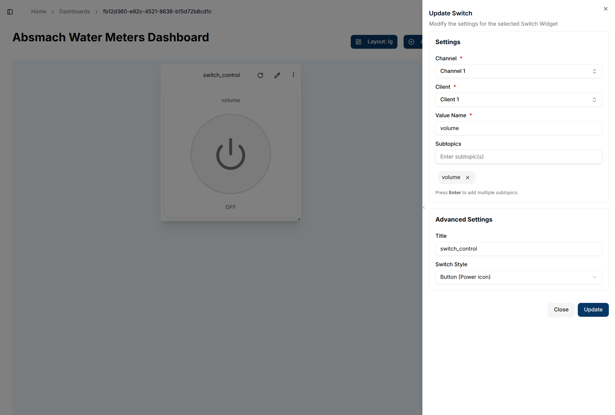
After updating the settings, click Update to apply the changes.
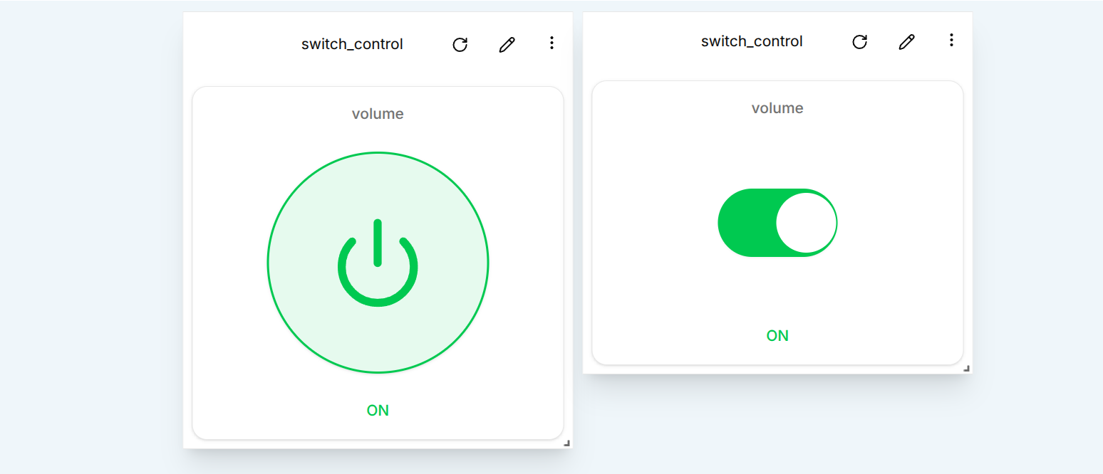
Using the Switch Card (ON State)
After editing, the switch can be toggled to the ON (true) state, sending a command to the connected device.
Switch Conclusion
Switch Cards are ideal for simple device control:
- Toggle ON/OFF commands
- Real-time interaction with devices
- Two visual styles: power button or slide toggle
- Configurable titles, value names, and channels
Slider Control
The Slider Card allows a user to send numeric values to a connected device through a channel. It’s perfect for use cases such as adjusting temperature, voltage, or fan speed.
Create a Slider Card
To create a Slider Card:
- Ensure the dashboard is in Edit Mode.
- Click the Add Widget button and select Slider.
- The Create Slider dialog will appear.
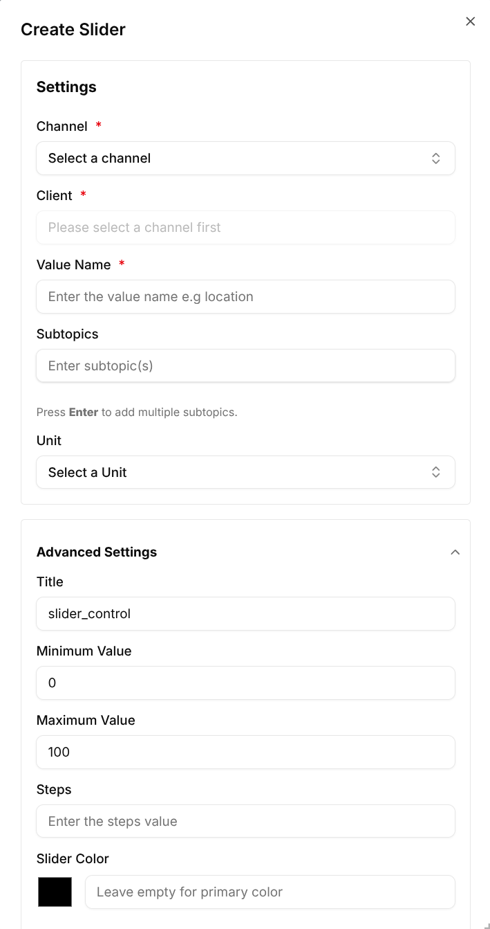
Configure the Slider Card
Configuration Fields:
- Channel (Required) – The channel for sending the message.
- Client (Required) – The target device receiving the value.
- Value Name (Required) – The metric being controlled (e.g., voltage).
- Subtopic – Optional subtopic for the message.
- Unit – The unit of measurement (e.g., L, °C, %, V).
Advanced Settings:
- Title – A custom title for the widget.
- Minimum Value – The lowest selectable value.
- Maximum Value – The highest selectable value.
- Steps – The value increment between slider positions.
- Slider Color – An optional color picker for the slider thumb. Leave empty to use the default primary color.
Click Create once the configuration is complete.
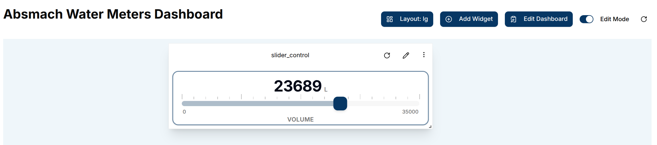
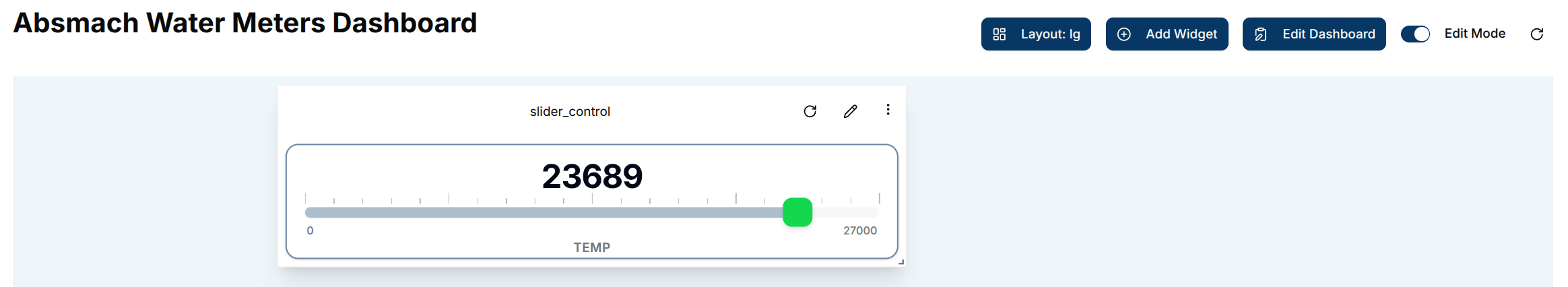
Use the Slider Card
Once added, the slider card shows:
- The current value and unit in large text at the top
- Tick marks above the slider track for visual reference
- The slider track with a draggable thumb
- Min / Max value labels below the track
- The configured value name at the bottom
Drag the handle to select a value. The new value is sent immediately to the target client.
Edit the Slider Card
To edit a Slider Card, click the pencil icon on the widget.
This opens the Update Slider dialog.
Editable Slider Fields
- Channel - Change the assigned communication channel.
- Client - Select a different connected device.
- Value Name - Modify the value being controlled.
- Subtopic - Modify the subtopic for the message.
- Title - Update the displayed title.
- Minimum & Maximum Values - Adjust the slider range.
- Steps - Define the increment between values.
- Slider Color - Change or clear the custom thumb color.
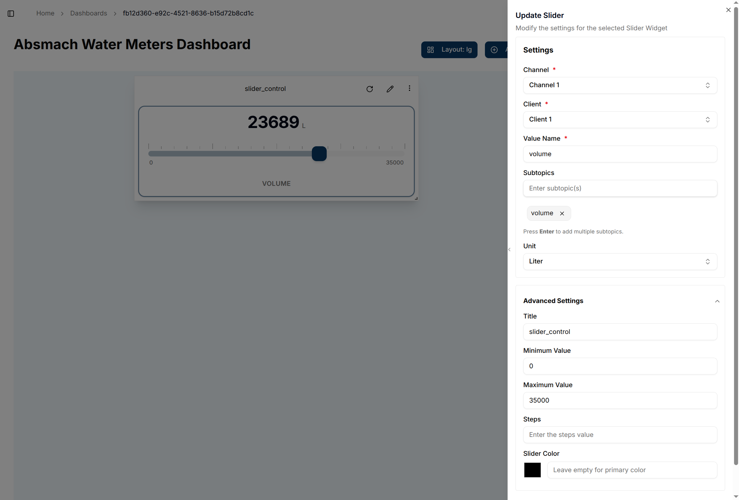
After making the necessary changes, click Update to save them.
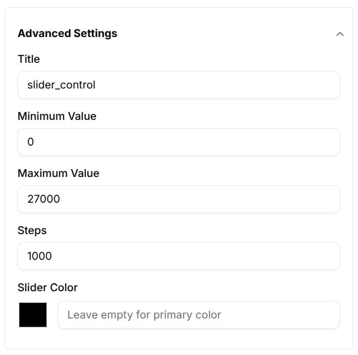
Using the Slider with Updated Steps
After editing, the slider values can be adjusted in defined steps (e.g., increments of 1000).
Conclusion
Control Cards enable direct, real-time control over IoT devices within a domain. Whether toggling a relay or adjusting a value, they provide a seamless, intuitive interface.
Key highlights:
-
Switch Cards for binary ON/OFF control
-
Slider Cards for precise numeric input
-
Full support for custom labels, update logic, and device targeting With Control Cards, managing connected devices from the dashboard becomes simple and efficient.